ASTRA app
Product Design | UI
ASTRA is designed to discovers enterprise data and makes it usable. ASTRA supports many use cases for many parts of the enterprise such as Data Governance, Self-Service Data Preparation for Analytics, Application Development and Support, and Quality Assurance/Test. ASTRA connects to databases, files, and XML documents across the enterprise. Its engine discovers all data and relations within these data, generating a comprehensive picture of the enterprise data landscape.
ASTRA is now called Io-Tahoe.
Discovery
Most business initiatives require an understanding of the baseline data landscape. As a foundational activity, data baselining will help CDOs, application architects, and data architects to:
- Understand and leverage the organizations’ metadata to limit data debt,
- Control IT costs, enable M&A, and prevent regulatory breaches.
Although being helpful and beneficial, data baselining without the right tools is frustrating, laborious, and error-prone. Furthermore, manual efforts required for this cannot be sustained.
The situation created an unprecedented opportunity for ROKITT Inc. Starting from 2014, is dedicated to providing an easy-to-use solution for the businesses to empower collaboration, save time and remove silos, by bringing people to a unified view of the data assets across technologies.
Scope
Primary use cases
Regulatory Compliance
Merger & Acquisitions
Application
Re-engineering
Understanding Dependency
Design Process
Starting steps
The team started the early conversation on defining the problem, identifying needs, and building user flow. Ideas were formed and carefully discussed/tested. The shape of the product gets more clear along the way. It is very crucial to narrow down the focus from the pool of ideas. At this stage, the team is focusing on:
Providing a clear, step-by-step approach for database processing and managing
Help users to understand the complex database with a visualization tool
Diving deeper into the two main goals, they were divided into smaller tasks and more specific modules.
Data processing and managing
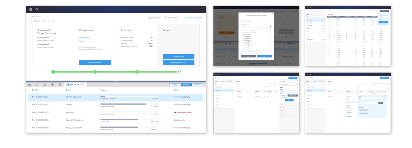
ASTRA is scoped to provide tools for analyzing databases, managing those data in multiple ways, and returning results for review in the desired way. There were 6 tools planned within ASTRA.
Relationship Discovery
Data Flow Analyzing
Data Subsetting
Data Retrieval
Data Masking
Synthetic Data
Each of the 6 tool has different goals, steps, input and user cases. But they can be summed up into linear process with customized steps, input methods and result projections.
Low fidelity
I started to create some very early versions and mockups for the key screens. It allows me to make incremental changes in very quick turn-arounds. The team, especially stakeholders needing help to visualize through actual layout, can keep up with the conversation happened, and provide further feedbacks to inform updates. We built a trackable version library while adding or adjusting solutions along the way. It was also when we rolled out early prototypes to test flows and functions.
Some problems are quickly identified: 1) awkward empty space on processing tool layout; 2) distance between highlighted step and the actionable panel within the step; 3) extra effort on focusing on current tab while having both left nav and top nav (also creating awkward boxes for content together with panel on the right).
The sample version was tailored to one user scenario in a brief way (even before details in each steps were even thoroughly discussed), which means the pattern could very much likely to fail when adapting to worst cases with more complicated steps. More than that, during user research it was noticed there were additional needs such as: 1) allowing to run multiple processing and monitoring each of them; 2) some tools will need additional input within steps; 3) necessity to review results up to the point currently processed, etc.
A new version of wireframe responded to the new requirements, with a different approach in the layout (image 1 below). I also created key screens for each user flow, and run testing on prototype.
The new version used a more open layout and horizontally-arranged step bar with CTAs right above it. For different requirements and scenarios for different tools, the input and display were tailored specifically around the needs. The iteration went on, the team looked into each case and flow, conducted research to inform design updates, and moving forth, to the end results.
High fidelity (samples)
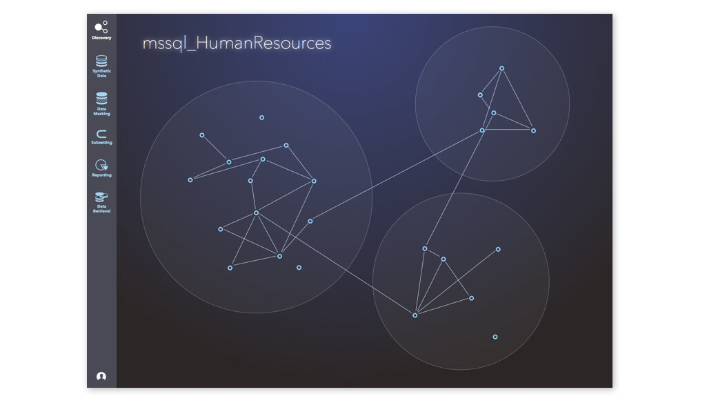
Discover data relationship within or across databases
Data flow analyzing
Subsetting data
Data retrieve
Synthetic data
Data visualization to help users understand their database with ease
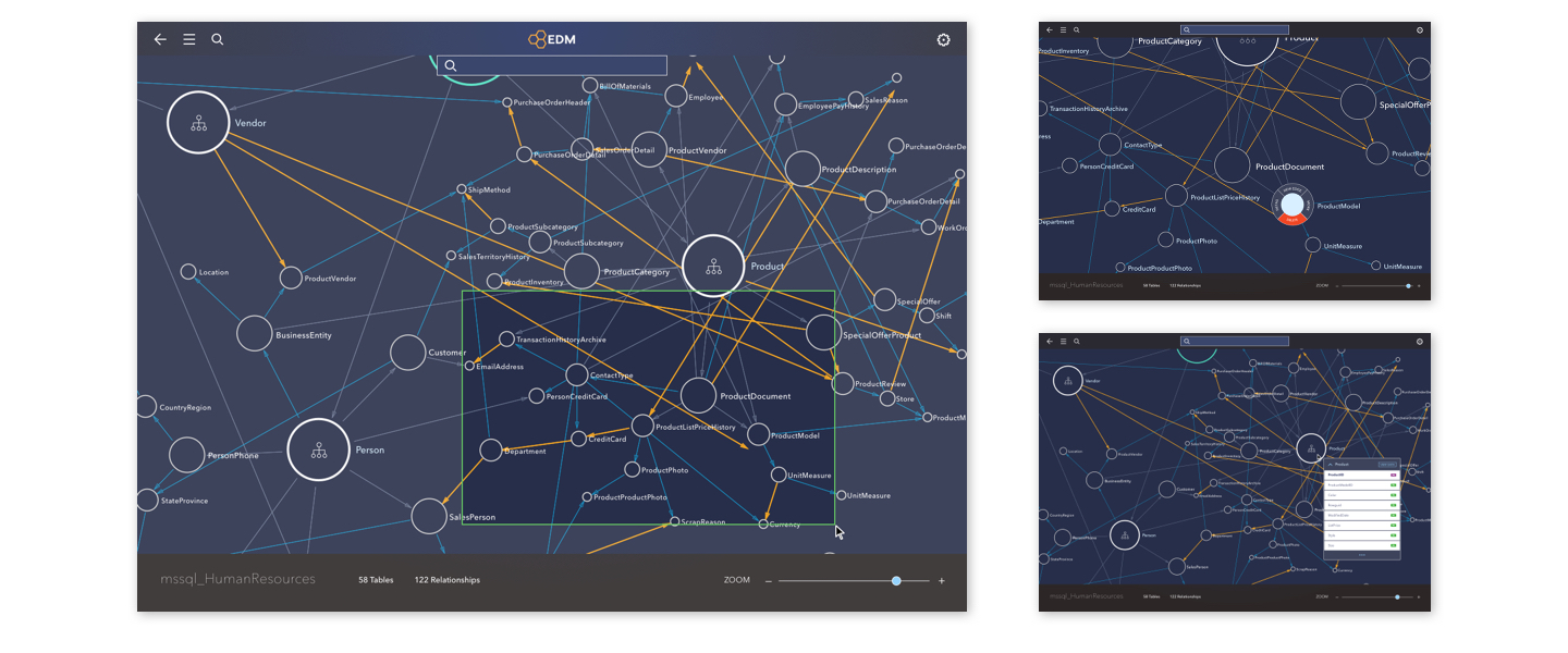
Another big goal of ASTRA is to provide clear data visualization to help users understand the structure of the database easier. This solution should be implemented within the data processing, serves as a more intuitive way to show relationships and connections of the data. in addition to the long, space-consuming table view of data (which swamps data analysts in their daily work).
In the early stage, the team worked with a small-scale database to get a sense of possible look and feel. It didn’t take long until we replaced it with a bigger, more complicated database, and there were more than one, which is closer to the environment of actual users.
Sample 3: Early version of data visualization, graph and table
The limited viewport for the graphics of this version again didn’t work in our favor. Design and development team worked very closely to test the actual look of the data with such volume and density. I created sample screens as visual guide for the look and feel of the projection.
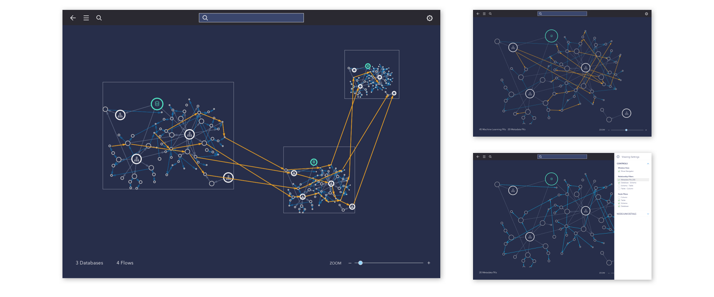
After a few rounds of testing and mocking up, I proceeded with a solution allowing more open space for better focus on the data map. New interactions are added for better navigation, and additional controls for the needs such as filtering. As the team dived deeper into more user cases and scenarios, I kept working on detailed solutions answering to more specific needs.
Sample 4: Early version of graphic view - high level
Bridging graph with its corresponding data
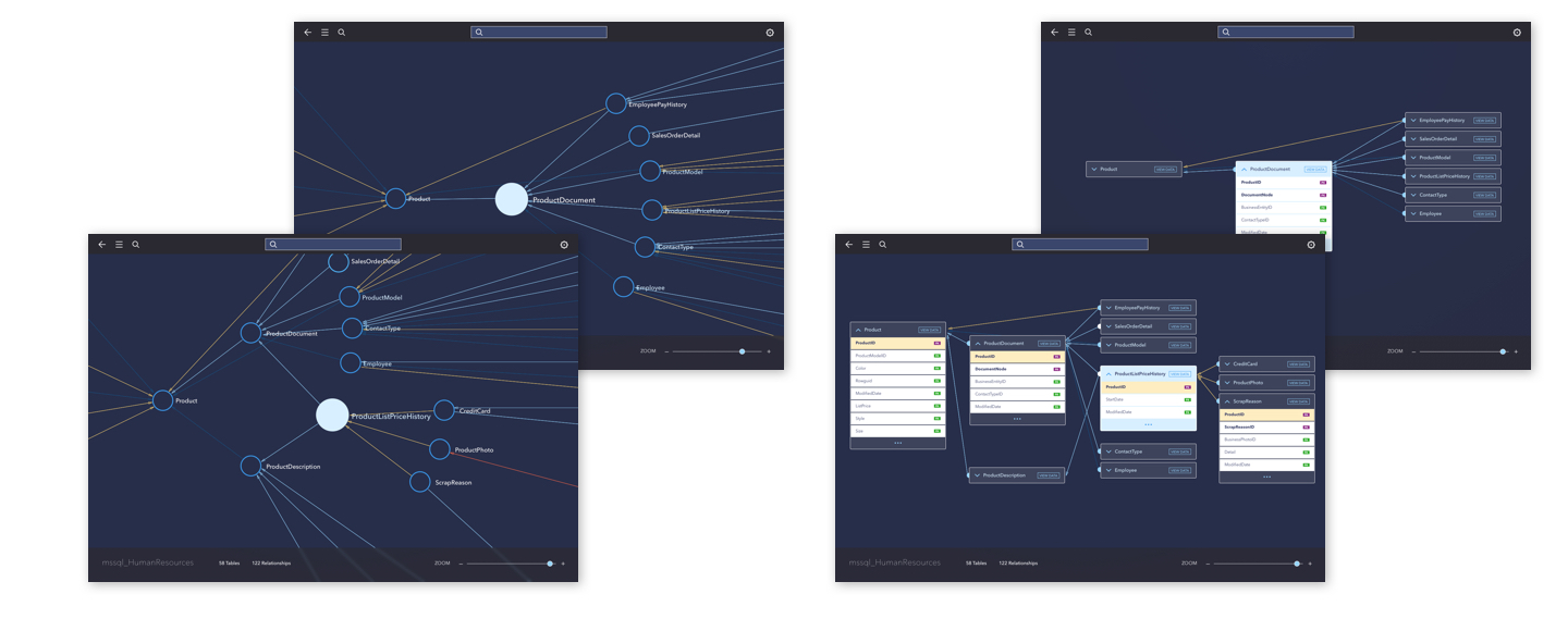
It is noticed from testing that the map view has a certain feeling of isolation from the data itself. To bridge the gap between the very illustrative view and the table view which is more familiar to the users, I presented a solution to allow connected data to “flip“ to its table self to review more details of how it connects to others. This solution wasn’t presenting the entire table, but just highlighting the columns connecting to other data, since the product itself has a big focus on discovering relationships of data. But here came another question: is it too chaotic to just flip all nodes currently in view?
Sample 5: Early version – zoom-in mode and extended table(column) view
Taking a step back from this question, the data map was already pretty chaotic, while zooming-in is already added to help users focus on certain part of the data. Search tool is also provided to help them get to their wanted data faster and more easily. I took a step further to the scenario that user wants to focus on one table in the graph view, and kept working on the features around their needs under such circumstances.
Clean up before viewing details
Looking back at the early sample for the flipped-table view, I started to notice that if the data flips as is, the additional data not directly connecting to it will randomly float around it. They are not only distracting, but also hurting the possibility for users to navigate along for more details. Thus I added a micro step before flipping happens: if user chooses a piece of data to reveal for more details (table view), the map will automatically clean up within the current view, pushing out not-directly-related data, organizing directly-related ones in the order of parent(left) to child(right). We later included function to allow showing 2 levels above (parent’s parent) since it’s meaningful data to users sometimes.
After the clean-up, flipping would happen in a more clear view. This solution not only helped users to focus on certain pieces of data, but also added the possibility to allow users to select parent or child data, and travel along the entire flow the original focused data was in. On top of it, new settings and features are also added to help users reveal more details of the data in focus.
High Fidelity (samples)
Relationship discovery: high-level mapping and filtering
Zoom-in and addition control
Afterthoughts
ASTRA was one of the biggest products I worked on in the year of 2015–2016 for ROKITT.Inc. The 8 months working for the first version of a widely-spanned product includes fast-paced working environment and endless iterations to improve the design. Thanks to the constructive conversations and hard-working team, we solidified the shape of the product. During the 6 months of production, I’ve gained a new level of understanding in designing for the very specific needs of users, and how to dive deeper to craft better experience for them. There’s still a lot to work on once the product is launched when more feedbacks from actual users and market reaction starts to come in. Learning from them could inform better design decisions and updates, which is the focus of the team moving forward.


